The Butt is On
I’ve been optimizing and cleaning up the AlertMe for Android app to put into the Google Play marketplace, and after using drawable shapes I figured that it was time to throw away those duplicate button images. The original used a technique familiar with web developers/designers: change the whole image according to the state of an element, in this case a button:
<?xml version="1.0" encoding="utf-8"?>
<selector xmlns:android="http://schemas.android.com/apk/res/android">
    <item
        android:state_enabled="false"
        android:drawable="@drawable/ic_home_status_home" /><!-- default state -->
    <item
        android:state_pressed="true"
        android:state_enabled="true"
        android:drawable="@drawable/ic_home_status_home_pressed" /><!-- pressed state -->
    <item
        android:state_focused="true"
        android:state_enabled="true"
        android:drawable="@drawable/ic_home_status_home_focus" /><!-- focus/hover state -->
    <item
        android:state_enabled="true"
        android:drawable="@drawable/ic_home_status_home" /><!-- default state, just in case -->
</selector> |
<?xml version="1.0" encoding="utf-8"?>
<selector xmlns:android="http://schemas.android.com/apk/res/android">
<item
android:state_enabled="false"
android:drawable="@drawable/ic_home_status_home" /><!-- default state -->
<item
android:state_pressed="true"
android:state_enabled="true"
android:drawable="@drawable/ic_home_status_home_pressed" /><!-- pressed state -->
<item
android:state_focused="true"
android:state_enabled="true"
android:drawable="@drawable/ic_home_status_home_focus" /><!-- focus/hover state -->
<item
android:state_enabled="true"
android:drawable="@drawable/ic_home_status_home" /><!-- default state, just in case -->
</selector>

All 3 images; a bit repetitive, no?
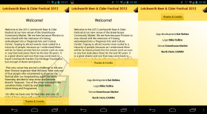
All rather neat so far. Now, developing for mobile you start to appreciate things like space – particularly when you phone is rather low on it (true story) – and the same image is kind of wasteful. Images are the worst to keep around for mobile application because they can only compress so far – while text is rather easy. When I did the Letchworth Beer Fest app I used shapes to define a background rectangle and a single image over the top, so now I save on 2 less images and a cleaner looking ‘button’ to boot:
<!-- excerpt for 'pressed' state: -->
<item android:state_pressed="true" android:state_enabled="true">
    <layer-list>
        <item>
            <shape>
                <gradient
                    android:startColor="@color/button_pressed_light"
                    android:endColor="@color/button_pressed_dark"
                    android:angle="270" /><!-- gradient box, just because -->
                <stroke
                    android:width="1dp"
                    android:color="@color/button_pressed_dark" /><!-- 1dp border -->
                <corners android:radius="3dp" /><!-- neat - round corners -->
                <padding
                    android:left="10dp"
                    android:top="10dp"
                    android:right="10dp"
                    android:bottom="10dp" />
            </shape>
        </item><!-- end box -->
        <item><!-- now overlay the image on top: -->
            <bitmap
                android:src="@drawable/ic_home_status_home"
                android:gravity="center" />
        </item>
    </layer-list>
</item>
<!-- now an excerpt for default state -->
<item android:state_enabled="true">
    <layer-list>
    <item>
        <shape>
            <solid android:color="@color/button_default_light" /><!-- can be anything, but I've made it transparent -->
            <corners android:radius="4dp" />
            <padding
                android:left="10dp"
                android:top="10dp"
                android:right="10dp"
                android:bottom="10dp" />
        </shape>
    </item>
    <item>
        <bitmap
            android:src="@drawable/ic_home_status_home"
            android:gravity="center" />
    </item>
    </layer-list>
</item> |
<!-- excerpt for 'pressed' state: -->
<item android:state_pressed="true" android:state_enabled="true">
<layer-list>
<item>
<shape>
<gradient
android:startColor="@color/button_pressed_light"
android:endColor="@color/button_pressed_dark"
android:angle="270" /><!-- gradient box, just because -->
<stroke
android:width="1dp"
android:color="@color/button_pressed_dark" /><!-- 1dp border -->
<corners android:radius="3dp" /><!-- neat - round corners -->
<padding
android:left="10dp"
android:top="10dp"
android:right="10dp"
android:bottom="10dp" />
</shape>
</item><!-- end box -->
<item><!-- now overlay the image on top: -->
<bitmap
android:src="@drawable/ic_home_status_home"
android:gravity="center" />
</item>
</layer-list>
</item>
<!-- now an excerpt for default state -->
<item android:state_enabled="true">
<layer-list>
<item>
<shape>
<solid android:color="@color/button_default_light" /><!-- can be anything, but I've made it transparent -->
<corners android:radius="4dp" />
<padding
android:left="10dp"
android:top="10dp"
android:right="10dp"
android:bottom="10dp" />
</shape>
</item>
<item>
<bitmap
android:src="@drawable/ic_home_status_home"
android:gravity="center" />
</item>
</layer-list>
</item>
List item select?
When I tried to use the same states for list items in my odd/even rendered lists, I switched over from setBackgroundColor to setBackgroundResource. However I found there wasn’t a change in the pressed or focus states. Some Googling later I found these states worked for me:
<?xml version="1.0" encoding="utf-8"?>
<!-- for the 'odd' background; you can guess there is another file using '@color/menu_even' -->
<selector xmlns:android="http://schemas.android.com/apk/res/android">
    <item android:state_enabled="false" android:state_pressed="false">
        <shape>
            <solid android:color="@color/menu_odd" />
        </shape>
    </item>
    <item android:state_pressed="true" android:state_enabled="true">
        <shape>
            <gradient
                android:startColor="@color/button_pressed_light"
                android:endColor="@color/button_pressed_dark"
                android:angle="270" />
        </shape>
    </item>
    <item android:state_focused="true" android:state_enabled="true">
        <shape>
            <gradient
                android:startColor="@color/button_selected_light"
                android:endColor="@color/button_selected_dark"
                android:angle="270" />
        </shape>
    </item>
    <item android:state_selected="true" android:state_pressed="false">
        <shape>
            <gradient
                android:startColor="@color/button_selected_light"
                android:endColor="@color/button_selected_dark"
                android:angle="270" />
        </shape>
    </item>
    <item android:state_enabled="true">
        <shape>
            <solid android:color="@color/menu_odd" />
        </shape>
    </item>
</selector> |
<?xml version="1.0" encoding="utf-8"?>
<!-- for the 'odd' background; you can guess there is another file using '@color/menu_even' -->
<selector xmlns:android="http://schemas.android.com/apk/res/android">
<item android:state_enabled="false" android:state_pressed="false">
<shape>
<solid android:color="@color/menu_odd" />
</shape>
</item>
<item android:state_pressed="true" android:state_enabled="true">
<shape>
<gradient
android:startColor="@color/button_pressed_light"
android:endColor="@color/button_pressed_dark"
android:angle="270" />
</shape>
</item>
<item android:state_focused="true" android:state_enabled="true">
<shape>
<gradient
android:startColor="@color/button_selected_light"
android:endColor="@color/button_selected_dark"
android:angle="270" />
</shape>
</item>
<item android:state_selected="true" android:state_pressed="false">
<shape>
<gradient
android:startColor="@color/button_selected_light"
android:endColor="@color/button_selected_dark"
android:angle="270" />
</shape>
</item>
<item android:state_enabled="true">
<shape>
<solid android:color="@color/menu_odd" />
</shape>
</item>
</selector>
The result is now a more unified look-and-feel as the button and list item states use the same focused and pressed highlighting colours.

Screenshots of the a pressed button (left) and a focused list item (right)