Halftone gradient
Graphic

Simple Halftones in GIMP

Playing around with the background of my ‘professional front‘, I wanted to create a neutral base for a series of rotating background images. I devised that a halftone effect would be simple but have the impact I wanted, though I’ve never tried to generate them from scratch before. Based on bktheman34’s Halftone Gradient GIMP Tutorial I discovered it isn’t too difficult.

My steps, for a black foreground to fade into white:

  1. Create a new file at the desired size with a white background, ensure that the default colour selections are set (black foreground, white background).
  2. Ensuring that black is selected as the forecolour, create your desired gradient effect; I used a radial foreground to transparent.
  3. Create a layer below the one with the gradient in the foreground colour (black)
  4. With the gradient layer active, select FILTERS > DISTORTS > NEWSPRINT, under SCREEN choose INTENSITY
  5. Set CELL SIZE to 40, OVERSAMPLE to 5, click OK
  6. Continuing with the distorted gradient layer active, select COLOURS > LEVELS..
  7. Under Output Levels, set the lower slider (which is set on the black end) all the way to the right side (the white end), click OK
  8. You now can choose to flatten the image or select the gradient layer as needed.
White Halftone Gradient

White Halftone Gradient, with the ‘foreground colour’ (black) layer set to invisible

To create a black gradient, continuing the steps:

  1. Merge the white gradient layer to the black ‘foreground’ colour layer
  2. Choose COLOURS > COLOUR TO ALPHA. Colour select ‘white’ (ffffff) in the From box and click OK
Halftone gradient

Black halftone gradient, with the ‘background colour’ set to alpha

Standard
BrewDog Concepts
Graphic

A beery concept: Brewdog T-series

TNP

Tactical Nuclear Penguin - original poster concept

A year or two ago, there was a spark of inspiration (might of been around the AGM) which fruited a certain penguin suited with a helmet and a nuclear/beer backpack. Perhaps it was a case of “I can do better than that” regarding the TNP T-shirt offering at the time, or from the growing love of BrewDog beers in general. A very good chance of it may of been Yvan’s comment from the AGM that all the pumpclips were the same shape – though good marketing for being consistent, it did not allow individual character for each beer to distinguish itself. Well, whatever motivation that was, the challenge was accepted.

The Penguin

TNP Helmet Version 2

TNP Helmet Version 2

Now in the more recent past, Yvan pointed out that BrewDog announced another competition to feature a fan’s artwork; naturally he had remembered the first version of the TNP poster/clip I created. One prerequisites were “as long as the BrewDog logo is featured”; which gave me the opportunity to redo a detail that bothered me since I finished the first version in the past: his helmet. I found it too simple, and recall the design process that I would like to have included both the BrewDog logo and the nuclear symbol but I didn’t have an idea how. With the time to think afresh and a quick Google for hardhats, I quickly drew version 2 of the helmet. With some liberal application of GIMP, the new version was created.

Tactical Nuclear Penguin - Version 2

Tactical Nuclear Penguin - Version 2

The Blonde

As previously mentioned, there were the lingering thoughts about the other beers BrewDog do and we love. And by the OCD inspired mantra “gotta catch ’em all” I needed to try the other concept that was in the old todos – Trashy Blonde. In my sketchbook I do have the first concept but I dismissed it for being overly sexual. This time I was determined to show the ‘Blonde in a different light – and thankfully I had something in mind: I had remembered a particular vintage bookcover which features on a wine bottle depicting a ‘trailer trash’ girl (Edit: it’s Loren Beauchamp’s “Sin on Wheels”) and this thought chained into carhops. ’cause, you know, got to pay the rent..

Trashy Blonde - sketch

Trashy Blonde - sketch

Trashy Blonde - final sketch

Trashy Blonde - final sketch

Trashy Blonde - line cleaning progress

Trashy Blonde - line cleaning progress

I’ll spare you, dear reader, of the cleanup process. With a short period of time and a more detailed drawing I didn’t bother with a ‘vectorized’ cleanup. But in the end, I needed to get my concept completed enough – a ditzy (but adorably cute) trailer-trash carhop Blonde:

Trashy Blonde - completed

Trashy Blonde - completed

The Star

Tokyo* - final, but rough, sketch

Tokyo* - final, but rough, sketch. Note the dark tones: that's lots of erasing and hard lines there

I think I have a slight case of OCD. After the ‘blonde and before I found T-shirt templates I was contemplating the next beer. Yvan can testify, and probably laugh, at the excruciatingly frustrating time I had getting something acceptable for the next concept. I did accept the challenge here as a learning curve, and boy did I get it: firstly I am out of practise with figure drawing, and secondly a mecha[1] artist I am not. With that as a clue, it is evident I settled with the Tokyo*.

[Footnote 1]: Mecha refers to the comic book and animation genre heavily featuring robots, which is very popular in Japan. Transformers, though American, was initially designed in Japan – as toys without a backstory before Hasbro hired writers to create one.

In the end, though acceptable I find the pose too static. I did reference Barbarella for the pose and gun, but it lacks movement and an air of ‘life’ like the other two. But perhaps this is the one I revisit next time; I feel inspirationally drained!

Tokyo* - completed

Tokyo* - completed

T-Beers for a T-shirt contest

Here are the completed concepts as ‘posters’. For a peek at the shirt designs go to my other site.

Tactical Nuclear Penguin

Tactical Nuclear Penguin

Trashy Blonde

Trashy Blonde

Tokyo*

Tokyo*

BrewDog Concepts

T-series: Pose like a team, 'cos this shit got copy-pasta'd!

Standard
Working for SchIT - 1
Nostalgia, Rants

Holy shit! It’s Working for SchIT!

Restoring web stuff without backups is almost impossible unless you are the paranoid type (in which, you wouldn’t have it publicly accessible in the first place). I say nearly since the ‘web is both wonderful and horrid about storing anything and everything put into it. Most of everything I’ve done in the past I usually look back and think “what the fuck, is this person drunk/on crack/not out of primary school?” and trawling my past trail of simply awful drivel did reveal one ‘gem’ (in the same vein as ‘salt of the earth’) – Working for SchIT.

For a refresher: Working for SchIT was a very sporadic web comic placed in my university webspace, that mainly focused on the lives of students/post grads in the School of Information Technologies. Of course, at the time, I was a student myself and the attitude that things were going downhill in passing pretty clueless students strongly influenced the writing. The ‘SchIT’ name-change of the formally known (perhaps old-fashioned sounding?) School of Computer Science (‘and Technologies’) was the straw that broke the camel’s back as it were. Those involved at the university at the time did find some amusement in the method of shortening the name.

As a disaffected university student (I give credit to Despair.com for that one), I graffiti’d my notebooks with plenty of ideas – but I didn’t process many beyond the sketch-phase. So, from the festering cesspools of the interwebs, I give you (what I could find) 3 out of the 4 comics in existence of Working for SchIT:

Issue 1

Working for SchIT - 1

Working for SchIT - We really hate cheating

This comic was written completely by Yvan (it does show, if you know him personally). He was the first to scrawl the outline on a napkin (probably) over coffee; at which we had a good chuckle – I had to get this prettified. The original sketch is in one of my scribble-books – used to spare some space in my notebooks for actual notes. This was one of the earliest examples of my use of GIMP (and shows how much of a n00b I was).

Also noteworthy: Vlad is based on someone Yvan and I know personally, though his appearance here was completely contrived. I wonder if it’s obvious who it is..

Issue 3

Working for SchIT - 3

Working for SchIT - Do not operate heavy machinery

Skipping issue 2 (I can’t find it), I remember not being motivated (see above) about writing something witty. I do recall that one day where one of the societies was giving out free ‘beer’ on a recruitment drive – which I did in fact retrieve – for joining. The society was relevant, but I didn’t actually drink the VB – it was for someone else (I didn’t ask either). I did eat the BBQ sausage-in-a-bread-slice though. Regardless, one really needs to question themselves if they are any self-respecting human for possessing such a thing.

Issue 4

Working for SchIT - 4

Working for SchIT - Sleep is for wimps

Pretty self-explanatory.

Wow, how quaint. I don’t think I’ve progressed far with my use of GIMP, but I know the reason why I don’t do illustrations like this more often: they require a bit of work. I guess I still share that ‘disaffected university student’ attitude yet..

Standard
Lloyd in Letchworth
Graphic

Cleaning up scanned sketches with GIMP and Inkscape

I’m no professional designer, but I do feel the need to get some sketching done once in a while. Sometimes I feel the urge to make a full colour image like my TNP fan art and various (now more-difficult-to-find) mini illustrations for Yvan’s blog. Without the formal training, and the expensive professional tools, I’ve used GIMP for years. For cleaner lines I’ve been including Inkscape to my routine – as SVGs can be easily resized without loss of detail. Look ma, no pricely-licensed software!

Lloyd in Letchworth

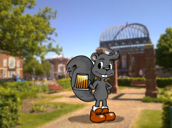
Lloyd in Letchworth - reminds me of "Dot and the Kangaroo"

The sketch to convert

Lloyd sketch - finalized design

Lloyd sketch - finalized design

The comic industry had to start off without computers in the beginning.. If you prefer the use of the ever-reliable pen/pencil and paper method like me you will need to come up with the cleanest copy of your subject to make the computer cleanup faster. Try to keep your guidelines as light as possible or in a colour you can ignore while you complete the sketch in a dark colour. It is common to use yellow pencils, or the aid of a lightbox and another piece of paper.

In the case of this drawing, I had a few ideas already in mind and used the best sketch. Though the main parts – the face and body – were clearly defined I planned to clean up the other sections in GIMP (it was also necessary as I photographed, rather than scanned, the sketch). I definitely could of created another cleaner sketch but I didn’t have the means to trace anew without losing some of the nuances with the lines, but for what it was worth the parts I didn’t detail (the legs/feet, arms) I was planning to make different interchangeable versions. GIMP is used to make the contrast much clearer from the original scan and an opportunity to correct rough parts. Of course, you are sufficient with a tablet then drawing straight into GIMP is nothing new.

Lloyd sketch - rough cleaned

Lloyd sketch - rough cleaned

The clean line

After processing the sketch to be as clean as possible, I import the image (just a link rather than embed) into a new SVG page in Inkscape. Then, with a Path → Trace Bitmap I produce a path of the sketch. After the path is made I can remove the imported bitmap and process the raw path.

Lloyd - 'final ink' stage in Inkscape

Lloyd - 'final ink' stage in Inkscape

At this stage, the aim is to ensure that the lines are smooth and crisp. If you need to make replaceable elements, create separate layers so it is easier to manage. For breaking up parts of the image faster I created duplicate layers and removed sections with the path tools as described here (though the “select offending nodes then remove from path” method is also effective).

Here, I have separated the arms, tail and beer mug from the main body. This way, not only can I produce better looking sections I can reuse them for other versions of the image. For example the forearm can be drawn holding something else like a flag rather than the beer mug. Though it is not seen, it makes sense that these individual layers are ordered from fore- to back- grounds.

Adding colour

Lloyd - lined and coloured

Lloyd - lined and coloured

Now, the fun starts. For each of the separate layers define by any means necessary paths to place behind the sketch-line paths. As with the line art, these paths are borderless, filled blobs. When you are satisfied with the colour, then you can add finer details like shadows and textures.

As the lines were already black, I was able to keep my shadow paths (with the exception to the bottom round shadow) as a separate layer above all the paths. Because the lines were simple, I also did this to the highlights (shine on the beer mug, boots). Both the highlights and shadows are semi-transparent so they can be reused for different colour schemes.

Name it; then go forth and reuse

As the sketch is now in SVG you can produce higher quality versions in any size you desire. The first illustration was produced by simply importing the sketch into GIMP and flipping horizontally onto a blurred background. Then final touch ups were made to try to create more of a fur texture and roughed-bottom shadow.

I had started to brainstorm name for the poor squirrel sketches but wasn’t satisfied with one until it started nearing completion. If you may know the background and the relevance of the beer mug then you could make an educated guess that it’s my take on the logo of the CAMRA-run beer festival down in Letchworth Garden City. My complaint is that ‘Lloyd’ needs to be a black squirrel – a common mutation of the grey squirrels in these parts – but I need to explore how to keep the line work from ‘fading into the background’.

For now, I’m quite happy how he’s turned out. I can tweak the colours later just by changing the path fill colour. Hope to see you around more often, Lloyd!

Standard